Onboarding project | Zolve

WHAT IS ZOLVE?
Zolve is a financial technology company, often referred to as a neobank, that provides banking services primarily aimed at global citizens, particularly immigrants moving to the United States. Founded in 2020 by Raghunandan Gangappa, Zolve offers a range of financial products including credit cards, checking accounts, and overseas student loans, designed to help individuals manage their finances across borders.
Zolve aims to simplify financial access for immigrants by offering products that do not require a U.S. credit history, which is often a barrier for newcomers. For instance, their credit cards allow users to build a credit score in the U.S. from day one. Additionally, Zolve provides an online platform where users can easily apply for and manage these financial products.
For more information about Zolve and its offerings, you can visit their Official Website [Apply Online for Zolve USA Credit Cards, Overseas Student Loan, USA Checking Account | Zolve].
ICP 1: New US Immigrant
ICP Name | New US Immigrant |
Job Title | Student |
Age | 18-35 |
Gender | All Genders |
Salaried | Unsalaried/Part-Time (earning from internships or part-time jobs, typically $500-$1500/month) |
Marital Status | Mostly unmarried |
Location | On University Campus (e.g., New York, California, Texas) |
Education Level | Pursuing Undergrad or Grad |
Income Bucket | Low to Medium Income ($0 - $20,000 per year) |
Apps for Time Spent |
|
JTBD |
without a US credit history) |
Frequency of Money Transfers | Once a month |
Frequency of App Visits | 2-3 times a month |
Top App Features |
|
Role in Buying Process | Primary Decision Maker |
Nationality Status | Indian Passport Holder, International Student Abroad |
Current Solution | American Banks, SWIFT |
Pain Points |
|
Job To Be Done For ICP1:
When Ruheen, a new US immigrant and student, uses Zolve to transfer money from India to her US bank account,
she wants to be able to access funds quickly and easily without the need for extensive documentation or a US credit history,
so that she can focus on her studies and daily expenses without worrying about financial constraints or delays in accessing her money.
ICP 2: Existing US Resident
ICP Name | Existing US Resident |
Job Title | Consultant |
Age | 22 and above |
Gender | All Genders |
Salaried | Salaried (earning between $60,000 to $120,000 per year) |
Marital Status | Mostly Married |
Location | Tier 1 or Tier 2 US Cities (e.g., New York, San Francisco, Chicago, Austin) |
Education Level | Completed Undergrad or Grad |
Income Bucket | Medium to High Income ($60,000 - $120,000 per year) |
Apps for Time Spent |
|
JTBD | Get Cheap and Fast Money Transfers to India |
Frequency of Money Transfers | Once a month |
Frequency of App Visits | 2-3 times a month |
Top App Features |
|
Role in Buying Process | Primary Decision Maker |
Nationality Status | NRI, H1B Visa Holder, or Green Card Holder |
Current Solution | SWIFT |
Pain Points | Initiate fast money transfers to family in India |
Job To Be Done For ICP2:
When Priya, an existing US resident and consultant, uses Zolve to transfer money to her family in India,
she wants to be able to send money quickly and securely with minimal transaction fees,
so that she can ensure her family’s needs are met promptly without worrying about high costs or delays.
JOB TO BE DONE GOALS
Job | Explanation |
|---|---|
Functional Goal | The primary functional goal that the customer is trying to achieve is transferring money between India and the USA. This includes both sending money to family back in India and receiving funds from India to support living and educational expenses in the USA. |
Personal Goal | The personal goal for the customers is to make these money transfers quickly and effortlessly. Users like Ruheen, a new immigrant student, and Priya, an established consultant, both need the process to be seamless and fast, ensuring that they can manage their finances effectively without unnecessary delays or complications. |
Financial Goal | The financial goal is to ensure that these money transfers are as cost-effective as possible. This means offering better exchange rates and lower transaction fees, which is crucial for users who regularly send money to support their families or cover their expenses. |
Primary and Secondary Jobs To Be Done
Given Zolve's ICP, we can conclude the following:
Primary Job To Be Done
The primary job for Zolve is to fulfill its customers' personal goal of quick and effortless money transfers. This is essential for users who need to access their funds promptly to manage their day-to-day expenses, education, or support their families.
Secondary Job To Be Done
The secondary job for Zolve is to fulfill its customers' financial goal of making these transfers cheaper and more cost-effective. This includes providing competitive exchange rates and low transaction fees, which are critical for users who want to maximize the value of their transfers.
The JTBD examples illustrated with the ICP profiles clearly show that the personal and financial goals of the users, align with Zolve's primary and secondary objectives.
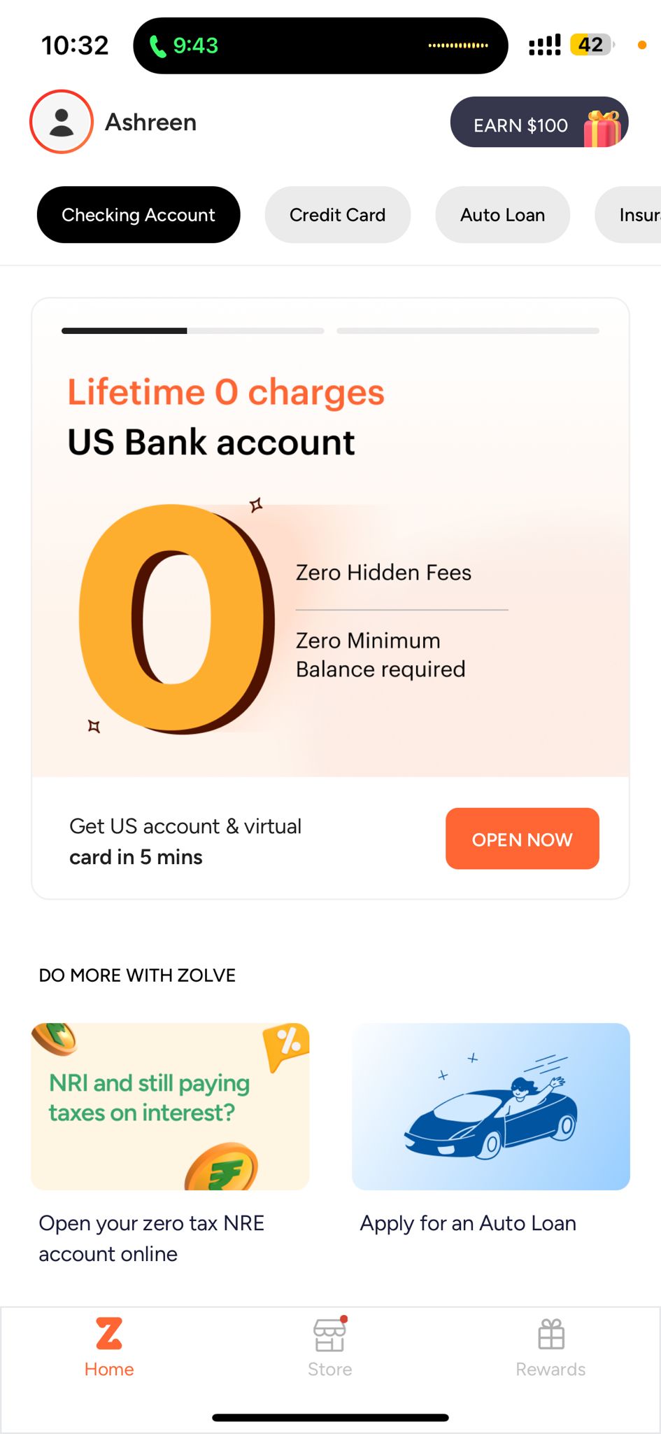
ONBOARDING TEARDOWN
Product Discovery: The product is first discovered on the Appstore by the user.


What’s Working Well:
- Visual Appeal:
- The app icon is clean and professional, helping to establish a strong brand identity.
- The app screenshots are high-quality and visually engaging, showcasing the app's key features.
- Clear Value Proposition:
- The description emphasizes key benefits such as "Open US checking account even before flying out" and "Choose from a variety of credit cards," which are likely to attract international users.
- Feature Highlights:
- The listing effectively highlights important features such as checking accounts, credit cards, and international money transfers, which are central to Zolve’s offering.
- Update Information:
- The “What’s New” section provides clear and concise updates, showing users that the app is actively maintained and improved.
Areas for Improvement:
- User Reviews:
- The app has a low rating (1.0 out of 5) based on two ratings, which can deter potential users. Although the Zolve team did Address the issues mentioned in the reviews, but they also need to encourage satisfied users to leave positive feedback, which could help improve this.
- Interactive Elements:
- Including a video demo of the app in action could provide a more dynamic and engaging way for potential users to understand its functionality and benefits.
PRODUCT JOURNEY:
Step 1: Welcome Page

What’s Working Well:
- Clear Branding: The Zolve logo is prominently displayed at the top, establishing brand recognition immediately.
- Attractive Offer: The message "Up to $10,000 Credit Limit" is prominently displayed, which can attract users looking for a high credit limit.
- Visual Appeal: The use of arrows pointing upwards, and the credit card graphic effectively convey the idea of financial growth and credit enhancement. There is also a dynamic carousel that shows other benefits.
- Simple Call to Action: The "LOGIN" and "CREATE ACCOUNT" buttons are clear and distinct, making it easy for users to take the next step.
- Clean Design: The overall design is clean and uncluttered, which helps in focusing user attention on the key message and call to action.
Areas for Improvement:
- Referral Code Entry: The screen could include an option to enter a referral code directly to streamline the process and capitalize on referral marketing.
- Progress Indicator: Adding a progress indicator can help users understand the steps involved in the onboarding process, reducing uncertainty.
Step 2: Sign-Up Screen

The sign-up screen prompts users to enter their email ID and an optional referral code. It also includes a message about using a university or company email to unlock more benefits. At the bottom, there is a checkbox for agreeing to terms of use, privacy policy, and communication authorization, followed by a "CONTINUE WITH EMAIL" button.
What’s Working Well:
- Clear Instructions:
- The instructions for entering an email ID are straightforward and easy to understand.
- The optional referral code field is clearly labeled, which helps in promoting the referral program without making it mandatory.
- Incentive for Using Specific Emails:
- The prompt to use a university or company email to unlock more benefits is a great way to encourage users to provide verifiable email addresses, which can also help in offering targeted benefits.
- Privacy and Terms Links:
- Including links to the terms of use, privacy policy, and communication authorization directly on the sign-up screen helps in maintaining transparency and building trust.
- Visual Hierarchy:
- The "CONTINUE WITH EMAIL" button is prominently displayed, making it easy for users to find and proceed to the next step.
Areas for Improvement:
- Referral Code:
- The optional referral code field could be accompanied by a tooltip explaining the benefits of entering a referral code, which can encourage more users to use it.
- Simplify the Checkbox Agreement:
- Automatically checking the agreement box (with an option to uncheck) might streamline the process. Users can still read the terms if they choose, but it speeds up the initial sign-up.
- Progress Indicator:
- Adding a progress indicator to show that users are on step 2 of the sign-up process can help reduce anxiety and manage user expectations.
Step 3 - Set Password Screen

The user is asked to set up a password with the given requirements, which include a minimum of 8 characters, at least one letter, one number, one uppercase letter, and one special character. The screen also has a "PROCEED" button at the bottom.
What’s Working Well:
- Clear Requirements:
- The password requirements are clearly listed, helping users understand what is needed to create a strong password.
- Visual Feedback:
- The criteria checkmarks provide real-time feedback as users type their password, indicating whether each requirement is met.
- Focus on Security:
- Emphasizing password strength criteria helps ensure that users create secure passwords, which enhances overall account security.
Areas for Improvement:
- Instructions:
- Simplifying the instructions further by using bullet points or icons next to each password requirement can make the requirements more user-friendly and easier to understand at a glance.
- User Guidance:
- Providing brief tips or examples for creating a strong password could help users who might be unsure about how to create a compliant password.
Step 4 - Email Verification

The user is asked to verify their email address. The screen indicates that a code has been sent to the user's email and provides an input field for entering the verification code. There is also a timer indicating when the user can request a new code.
Areas for Improvement:
- Resend Code Button:
- Instead of just displaying a timer, providing a visible "Resend Code" button that becomes active once the timer reaches zero can make it easier for users to request a new code without having to wait and watch the timer.
- Assistance Option:
- Including an option for users to get assistance if they do not receive the code (e.g., "Didn't receive the code? Contact support") can help users who encounter issues and reduce frustration.
Step 5: Phone Number Input

The user is asked to enter their phone number. The screen includes a field for the phone number prefixed by the country code, with a note advising users not to use a VOIP number.
Areas for Improvement:
- Assistance Option:
- Including an option for users to get assistance if they encounter issues with entering their phone number (e.g., "Having trouble? Contact support") can help reduce frustration and provide a better user experience.
- Auto-detection of Country Code:
- Implementing an auto-detection feature for the country code based on the user's location can streamline the process and enhance the user experience by reducing manual input.
Step 6: Phone Number Verification

The user is asked to verify their phone number. The screen indicates that a code has been sent to the user's phone number, with an input field for entering the verification code. There is also a timer indicating when the user can request a new code.
What’s Working Well:
- Clear Instructions:
- The message "We've sent a code to +91 XXXXXXX5181" clearly informs the user about the next step in the verification process.
- The input field for the verification code is prominently displayed, making it easy for users to locate and use.
- Visual Feedback:
- The timer indicating "You can request the code again in 53 secs" sets clear expectations for the user, letting them know when they can request a new code if necessary.
Areas for Improvement:
- Resend Code Button:
- Instead of just displaying a timer, providing a visible "Resend Code" button that becomes active once the timer reaches zero can make it easier for users to request a new code without having to wait and watch the timer.
- Assistance Option:
- Including an option for users to get assistance if they do not receive the code (e.g., "Didn't receive the code? Contact support") can help users who encounter issues and reduce frustration.
Step 7: Personal Information Input

The user is asked to enter personal information, including their title, legal first name, legal last name, and date of birth. The screen provides a note to ensure that the information matches their national ID or passport. There is also a "CONTINUE" button at the bottom.
What’s Working Well:
- Clear Instructions:
- he instructions to ensure the information matches the user's national ID or passport are clear, helping users understand the importance of accuracy in this step.
Areas for Improvement:
- Progress Indicator:
- Including a progress indicator or step number (e.g., "Step 6 of 7") can help users understand where they are in the onboarding process and how many steps remain, reducing anxiety and improving the user experience.
- Help or Tooltip:
- Adding a help icon or tooltip next to the form fields explaining why this information is required can provide additional context and reassurance to users about the importance of these details.
STEP 8: COUNTRY OF CITIZENSHIP AND RESIDENCE

STEP 9: PURPOSE OF VISIT

STEP 10: ADDRESS INPUT

STEP11: EDUCATION DETAILS

STEP 12: PIN SETUP

STEP 13: CONFIRM PIN

STEP14: APP INTERFACE
TEARDOWN FOR STEPS 8-14
What’s Working Well:
- Guidance: Clear instructions ensure users understand the importance of providing accurate information.
- Clear Instructions: Users are clearly prompted to enter the required information.
Areas for Improvement:
- Resend Option Visibility: The resend option should be more noticeable to enhance usability.
- Additional Context: Providing examples or explanations for each option can help users make informed choices.
- Progress Indicator: Including a progress indicator or step number (e.g., "Step 7 of 8") can help users understand where they are in the onboarding process and how many steps remain, reducing anxiety and improving the user experience.
OBSERVATIONS ABOUT THE ONBOARDING PROCESS
- Getting through 14 steps to just get to the app home page was an extremely tedious process. I believe that the length of this process would have an impact on the drop off rate of potential users through the sign-up process.
- Lack of Clarity at the beginning of sign up: The way the sign-up page was set up, it seemed like all one needed to get access to the app's home page and start browsing through the product would be to enter their email address. But there were an additional 11 steps after one had entered their email that the user had to go through.
- Lack of Journey Map of the Onboarding Process: I think it would be greatly beneficial to provide the users with a journey map at the beginning of the onboarding process, which would not just prep them for the entire process and reduce user restlessness through the sign up but would also give them a sense of confidence due to the transparency provided. This would also maintain clarity on the number of steps that they could expect through this sign-up process.
- Lack of Content Flow: I noticed that after asking for the country of residence the next prompt was details on one's career path and then the prompt after that was asking for the user's current address. This is indicative of a distorted user flow, asking for the users address right after their country of residence would make for a more natural progression and maintain a more natural flow for the users.
- Lack of Optional Metrics: Once the user has already verified their email, I believe an additional phone number verification might be testing the user's patience. Moreover, this information is only being collected for the purpose of follow ups, so for those potential users who do not want to be bothered with phone calls, this would be their drop off point. Making this input, as well as inputs such as current address optional, would definitely help reduce the drop off churn at the onboarding stage in addition to making the onboarding process less tedious.
ACTIVATION METRICS
Since the JTBD of Zolve is to allow for fast money transfers between India and US, this value prop will first be experienced by the user post their first money transfer. There is some evidence suggesting that when once opens up a checking account with Zolve they are bound to use it for some money transfers and hence experience the Value Prop, which is why we can have milestones for the Activation Metric:
- Milestone 1: Open a Checking Account
- Milestone 2: Perform their first transfer between India and US
- Milestone 3: Perform 5 or more transfers between India and US. ( Post 5 transactions the user is classified as a very active user)
Activation Metrics that would be key levers for the product:
- Hypothesis: Open Checking Account within 7 days of sign up
Having an Open Checking Account is the first milestone in experiencing the Value prop of this product. If this first milestone isn't crossed within the first seven days of sign-up then the retention probability of the user will most likely drop drastically, rendering any further attempts at conversion of the user useless. We must also understand that transfer of funds for our ICP is more often than not a monthly event. So, if we don't convert our users in this window when they most need to transfer their funds then our utility to them is lost.
- Hypothesis: Perform the first money transfer within 30 days of Opening the Checking Account
Performing the first money transfer is the second milestone in experiencing the value prop of this product. This is the key point where the user experiences the full potential of this product. Again, since the transfer of funds for our ICP is a monthly event, if our users do not perform their first transfer within the first 30 days of opening the checking account, it means we have most likely missed their window to perform this transfer and that they might not then experience the full value proposition of this product.
The following Metrics will be tracked in detail:
- D1, D7 and D30 Retention
Customer retention rate will be measured on a D1, D7 and D30 timeframe
On D1, the focus is on the first-time user experience. We need to track and analyze events during the tutorial to identify specific drop-off points. By optimizing these areas, we can achieve better retention.
On a D7 level, the user has most likely made their first transfer and have experienced the product value prop. Day seven is a good indicator of mid-term user retention.
By day 30, the user has become used to the ease that the product has to offer and has already become integrated into the Zolve ecosystem. This means the app's D30 usually will look a lot like D365 retention and D30 is a key predictor in the long-term retention of the product
- MAU by Geography
I believe MAU is essential to understand how users are engaging with the product and can also give us baseline to understand their retention patterns across geographies. For example, we have two types of users, first are Indian citizens moving to the US and the second are already US residents. These users will have different engagement rates with the product, which is important to analyze in order to understand the retention patterns of our users.
- TAT for Checking Account Activation
Another metric that is crucial to maintain a good retention rate would be the TAT for the activation of the Checking Account. Money Transfers are usually time sensitive and a long TAT to get the activation process of the checking account complete will lead to a low retention rate. So, this metric will be absolutely crucial to ensure efficient onboarding.
Brand focused courses
Great brands aren't built on clicks. They're built on trust. Craft narratives that resonate, campaigns that stand out, and brands that last.


All courses
Master every lever of growth — from acquisition to retention, data to events. Pick a course, go deep, and apply it to your business right away.


Explore courses by GrowthX
Built by Leaders From Amazon, CRED, Zepto, Hindustan Unilever, Flipkart, paytm & more
Course
Advanced Growth Strategy
Core principles to distribution, user onboarding, retention & monetisation.
58 modules
21 hours
Course
Go to Market
Learn to implement lean, balanced & all out GTM strategies while getting stakeholder buy-in.
17 modules
1 hour
Course
Brand Led Growth
Design your brand wedge & implement it across every customer touchpoint.
15 modules
2 hours
Course
Event Led Growth
Design an end to end strategy to create events that drive revenue growth.
48 modules
1 hour
Course
Growth Model Design
Learn how to break down your North Star metric into actionable input levers and prioritise them.
9 modules
1 hour
Course
Building Growth Teams
Learn how to design your team blueprint, attract, hire & retain great talent
24 modules
1 hour
Course
Data Led Growth
Learn the science of RCA & experimentation design to drive real revenue impact.
12 modules
2 hours
Course
Email marketing
Learn how to set up email as a channel and build the 0 → 1 strategy for email marketing
12 modules
1 hour
Course
Partnership Led Growth
Design product integrations & channel partnerships to drive revenue impact.
27 modules
1 hour
Course
Tech for Growth
Learn to ship better products with engineering & take informed trade-offs.
14 modules
2 hours
Crack a new job or a promotion with ELEVATE
Designed for mid-senior & leadership roles across growth, product, marketing, strategy & business


Learning Resources
Browse 500+ case studies, articles & resources the learning resources that you won't find on the internet.

Patience—you’re about to be impressed.